Choropleth Map of the UK with R - Part II: Is Central London a Ghost Town?
In the first part, we get a nice tool of visualisation of the district postcode area, a chloropeth Map.
Now, I want to do some real analysis on the districts.
In the first part, I have calculated the area of the UK districts.
Crawling on the british statistic national office, I found a table with the population at the district postcode level. At this level of accuracy, only a few metrics are available. But having the area and the population, I could calculate the density.
Before to go further, a first mapping of these data show huge inconstency looking at places I would expect highly populated. For exemple, Central London shows a low density, where I would expect a high density. The perfect exemple is the number of inhabitants in EC1A, 878 in 2011. This number is highly surprising. Consequently, what I represent here is not the reality, it is the snapshot captured in the data, made by humans and as such could be far from the reality.
Mapping the density
I made here a small map of the density in the UK:
  theme_map_uk <- theme(legend.position = "right"
        , axis.ticks = element_blank()
        , axis.text = element_blank()
        , axis.title = element_blank()
        , panel.margin = unit(c(0, 0, 0, 0), "mm"))

ggmap(map)  +
  geom_polygon(data = pop2, aes(x = lng, y = lat
        , fill = density.cut, group = name), alpha = 0.8, size = 0.6) +
        scale_fill_manual(values = brewer.pal(8, "Greens"), name = "Density of\n Population\n(pop/km2)") +
  theme_map_uk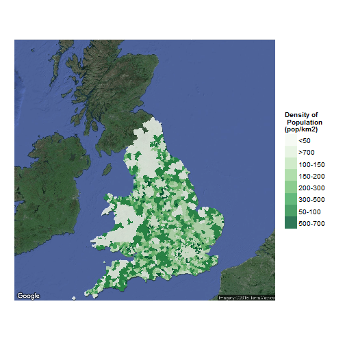
A bigger one (45 Mb) could be found with the code to produce it in my github account, here.
The code to produce the map could be found there as well. I tried to plot a map so detailled that you could zoom to distinguish the most tiny postcode area, like EC1 in central London.
Further Analysis
Even considering that the data in the most dense area is biased, it is still posible to analisys this data set. Here, I will do a spatial clustering of the districts looking at the density.
To have a coherent cluster, I took the logarithm of the density, as the density goes from 0 to 400K people per km2.
I limit the lower bound of size of cluster to 10, to avoid outliers to create clusters.
My first attempt with k-means showed a really low resilience of the clustering looking at the initial points and the seed. To counter that effect, I tried a bagging k-means cluster, which didn’t created nice looking region.
In the end, I choosed a simple hierarchical cluster with the ward measure.
We took the mean of the coordinates which make the polygon of the district as the center of the district. It introduces some bias in direction of the most accidented side of the district, but it is enough for what I want to achieve.
With a final number of cluster of 15, it is possible to define new British regions based on the density of population.
# Ward Hierarchical Clustering. pop4 is a data.table
d <- dist(pop4[, list(x, y, density2)], method = "euclidean") # distance matrix
fit <- hclust(d, method="ward.D2")
groups <- cutree(fit, k=15) # cut tree into 15 clusters

#pop4b <- cbind(pop4, predict = bclust.res$cluster)
pop4b <- cbind(pop4, predict = groups)
pop4c <- merge(pop2, pop4b[, list(predict, name)], by = "name", all.x = T)
pop4c[, density.cut.predict := log(mean(density)), by = "predict"]ggmap(map) +
geom_polygon(data = pop4c, aes(x = lng, y = lat
, fill = density.cut.predict, group = name), alpha = 0.8, size = 0.5) +
scale_fill_continuous(name = "Density of\n Population\n(log(pop/km2))") +
theme(legend.position = "right"
, axis.ticks = element_blank()
, axis.text = element_blank()
, axis.title = element_blank()
, panel.margin = unit(c(0, 0, 0, 0), "mm"))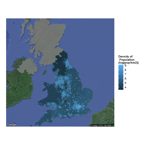
With a zoom on Greater London:
ggmap(map2)  +
  geom_polygon(data = pop4c, aes(x = lng, y = lat
        , fill = density.cut.predict, group = name), alpha = 0.8, size = 0.5) +
    scale_fill_continuous(name = "Density of\n Population\n(log(pop/km2))") +
    coord_map(xlim = c(-1, 1), ylim = c(51, 52)) +
  theme_map_uk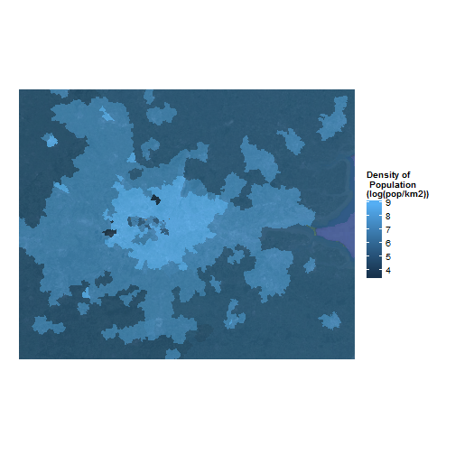
We could clearly sees that in central London, the numbers are oddly low, then suddenly very high when we go further and it decrease with the distance.
Conclusion
In the end, it is really easy to create new regions and to make really accurate clusters of district. The question of the small number of inhabitants in central London is definitely weird and appeal new analysis, looking for exemple at the number of offices and houses. If a majority of the constructions are offices, the mistery would be resolved. Otherwise, in spite of the tremendous amount of activity, these part of London could be nicknamed as “the ghost town”.


Leave a Comment